Analytics Features
About
This page demonstrates the process of accessing and viewing various analytical options available within the web application.
Analytical options that National Pilot offers
Activity dashboard
Idling dashboard
Daily activity calendar
Activity scatterplot
Cross location stats
Steps to access the analytical features
Log into your National Pilot web application here National Pilot web application
Once logged in, Please click on the analytics section to open up different visualisations
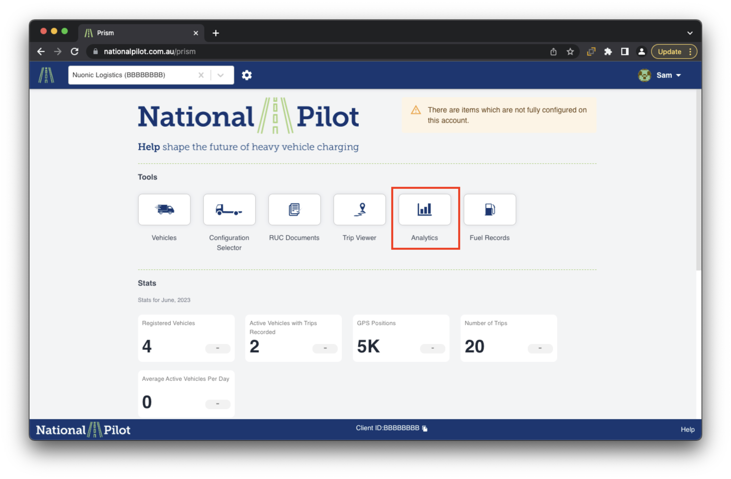
Analytics Features
Activity Dashboard
This page presents an interactive graph that visually represents data for different days of the month. It showcases optional features such as distance, time, utilisation, idling, and vehicle count. By interacting with the graph, users can gain valuable insights into the performance and activities of vehicles throughout the month.
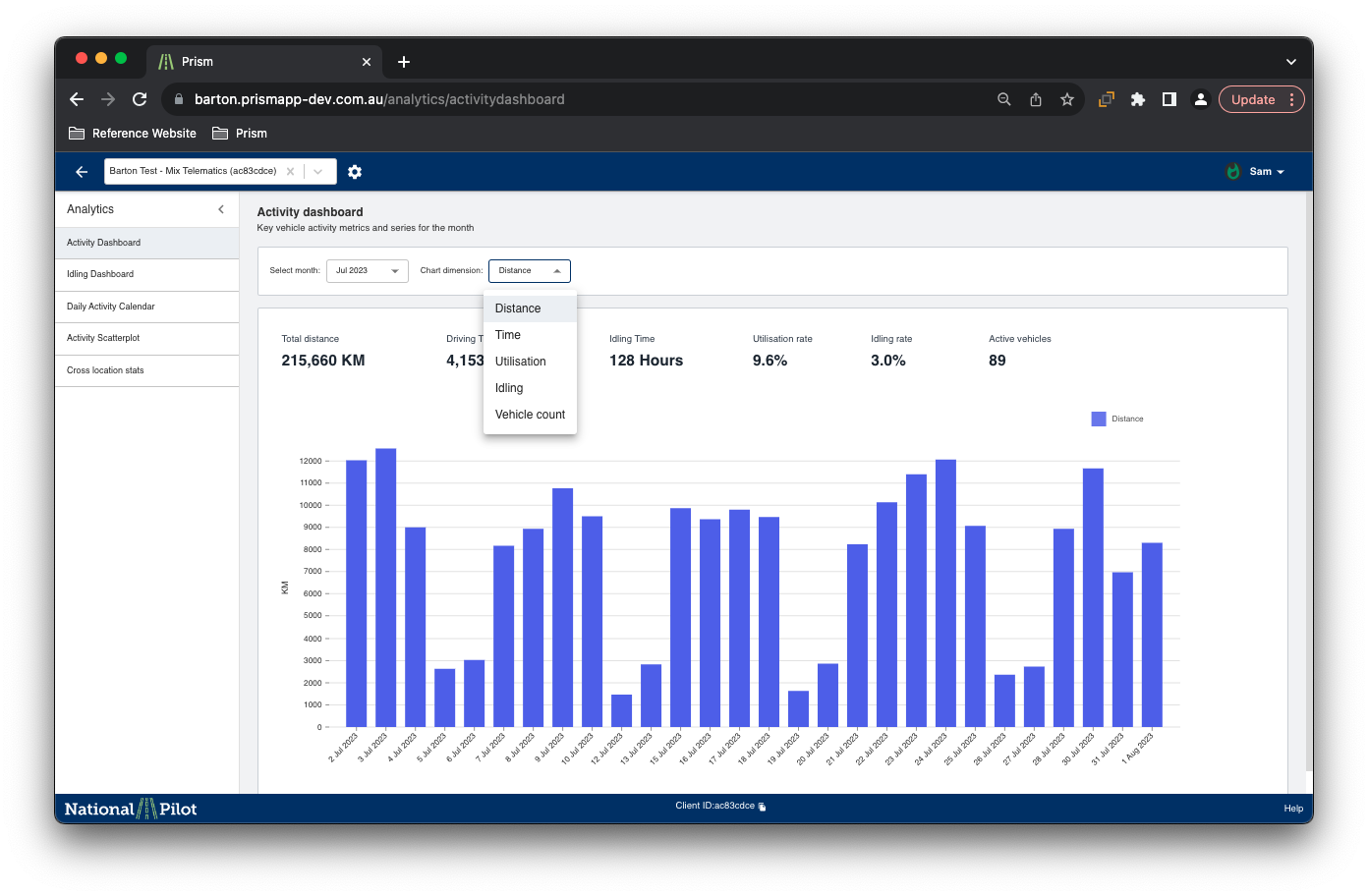
The graph’s user-friendly interface allows for easy exploration and analysis of the data, enabling users to make informed decisions based on the presented metrics. Whether it's tracking distance traveled, analysing utilisation patterns, or understanding vehicle idling behaviour, this interactive graph offers a comprehensive and efficient way to understand the dynamics of the vehicle fleet over time.
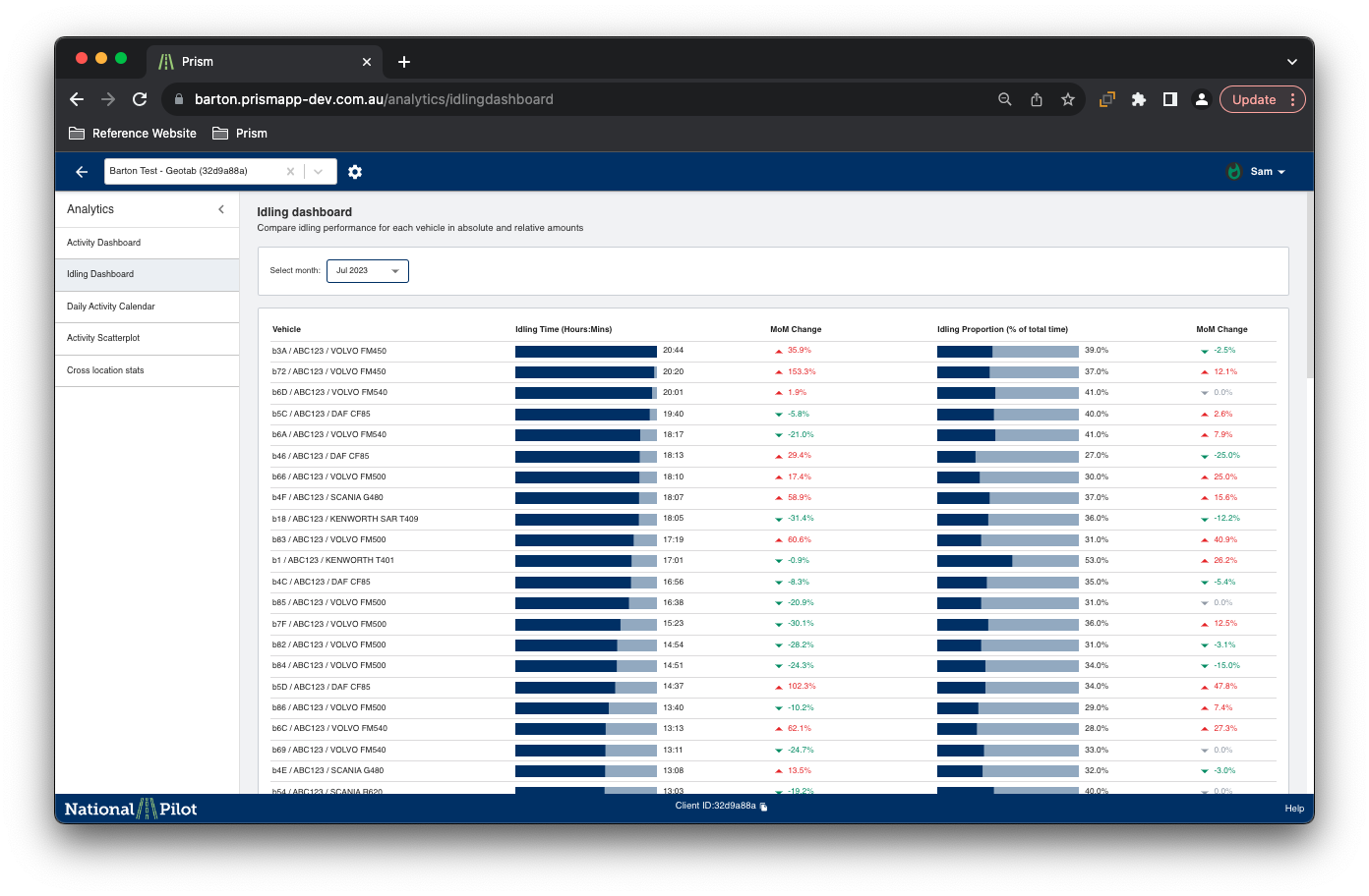
Idling dashboard
The idling dashboard is a comprehensive and detailed visualisation tool that provides insights into individual vehicle idling times over the course of a month. It presents a visual representation of idling behaviour, allowing users to track how long each vehicle remains idle during different time periods.
Additionally, the dashboard displays data for each month, making it easy to observe changes and patterns in idling habits over time.
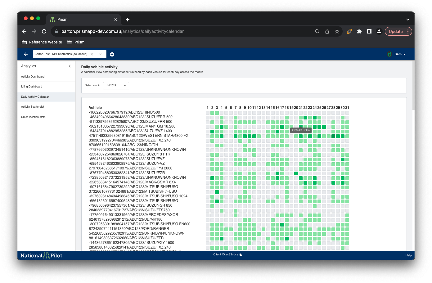
Daily Activity Calendar
The daily activity calendar is a dynamic and interactive visualisation that displays the overall activity of individual vehicles on different days of the month, along with the corresponding distance covered.
By selecting the a particular month, the user would be able to see the detailed vehicle activity for that particular month.
Activity Scatterplot
The activity scatterplot page offers users a range of visualisation options to analyse various vehicle activities, such as average speed against average trip distance, idling time percentages, and more.
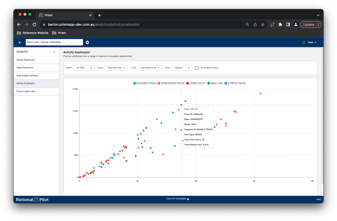
The scatterplot graph allows users to plot and compare these activities to identify any potential correlations or patterns. By selecting the desired parameters, users can easily generate visual representations that reveal insights into the relationships between different aspects of vehicle behaviour.
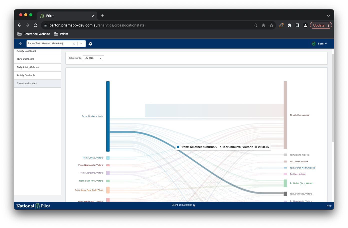
Cross Location Stats
The "Cross Locations Stats" section provides users with the ability to visualise the geographical locations covered by the vehicles during a selected month. By using this feature, users can gain valuable insights into the distribution of vehicle movements across different areas over time.
The visualisation is interactive and allows for easy identification of regions that experience more vehicle activity and helps analyse the overall coverage of the fleet during the chosen month.